
Type Design
Type High
Fall + Spring 2020
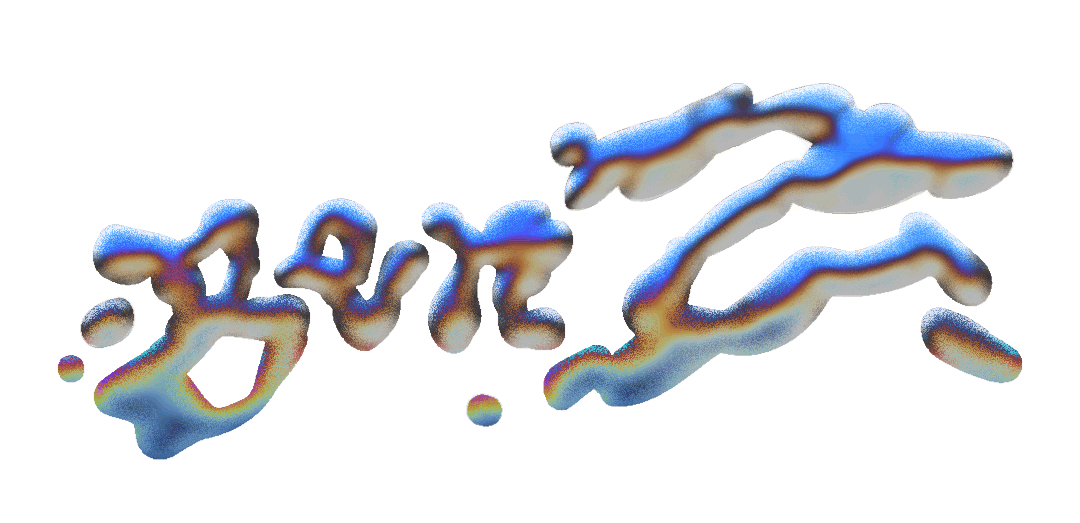
In the Fall semester of 2019, I set out to design a typeface inspired by weed, drawing from both the physical forms of the cannabis plant and the psychoactive effects of THC & CBD.
As my first attempt at type design, I was intrigued by the breadth of creative opportunity both in letterforms as a medium and the cannabis industry as a subject. I was also heavily influenced by the expressive typography of Leah Maldonado and James Edmondson. The typeface was named after the term “type-high,” a nod to the incredible engineering of metal and wood typesetting.


Type Specimen, Cover + Inside Front Cover
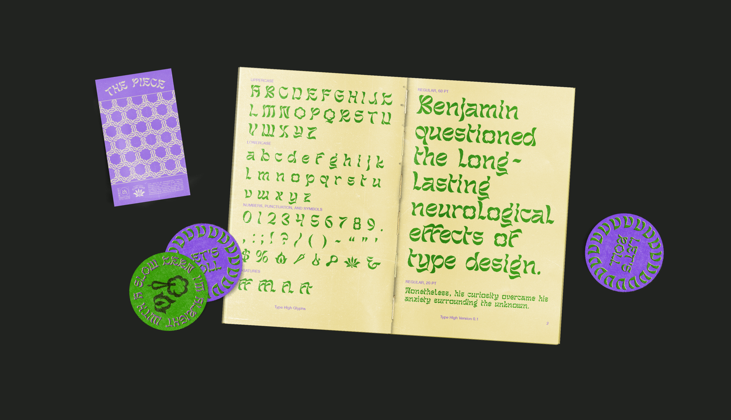
Type Specimen, Type High Glyphs + Testing
Months of sketching through Fall 2019 revealed many different potential directions, but most of them were half-baked (wink wink). In the end, several elements within these sketches made it into the final design. I wanted letters that felt like plumes of smoke doing pirouettes in the air, or like laying in a field of tall, tangling grass under the glow of the moon.


Typography is one of the most powerful tools in graphic design, which was one of the main reasons I sought out designing a typeface. As much fun as I had pixel-pushing bezier curves in Glyphs, I also enjoyed giving Type High its own identity once the letterforms were finished. Obvious color choices were green and purple, and various cannabis products and packaging (like rolling papers, for example) informed the design of the specimen. Creating the identity also made me appreciate Type High’s potential for pattern-making.

Type Specimen, Various Marijuana Strains + Insert
